
 EN

How to Select Black Cosmetic Tubes for Premium Makeup Lines
Black cosmetic tubes can give a premium makeup line a controlled, high-contrast identity. Still, black cosmetic tubes are not premium by default. The finish, print hierarchy, tube format, cap, and approval process must work together. For a B2B makeup project, this is therefore a product-development decision, not simply a color choice.
Start by defining what the tube needs to communicate. A high-fashion color range may want drama and polished highlights. A clinical treatment range may need restraint and easy-to-read information. A professional makeup line may need the package to make shade or function coding instantly clear. The right choice follows the product position rather than a generic luxury trend.
Decide What the Black Tube Should Say About the Range
Before comparing materials or decoration, ask what role the package plays in the portfolio. Are they the visual base for every SKU, a hero format for a flagship product, or a neutral field for seasonal colors? This decision affects how much contrast, texture, and color accent the package needs.
A glossy black surface can feel sharp, graphic, and highly finished. A matte black surface can appear quieter and more tactile. Neither surface is inherently better. The suitable finish depends on the formula category, outer carton, retail environment, and intended customer experience. A luxury concept should be checked on real components rather than approved only from a digital rendering.
- For minimal premium ranges, the tube may need fewer graphic elements and generous clear space.
- For color cosmetics, the package often needs a deliberate shade cue or product-category marker.
- For professional-use products, the container should keep names, directions, and variant information easy to identify.
Make Print Legibility a Design Requirement
On a black tube, every ink color, metallic effect, and fine line must be judged for contrast. Artwork that looks clean on a flat screen can behave differently on a curved surface. Highlights, seams, texture, and handling can all change the perceived clarity of small text.
Build the artwork hierarchy before approving decoration for the tube. Identify the information that must be read at a distance, the information that is needed in hand, and the copy that can remain secondary. Brand marks, product names, shade codes, and required information should not compete for the same small visual area. White and pale inks may create strong contrast, while tone-on-tone or metallic details deserve a closer sample review.
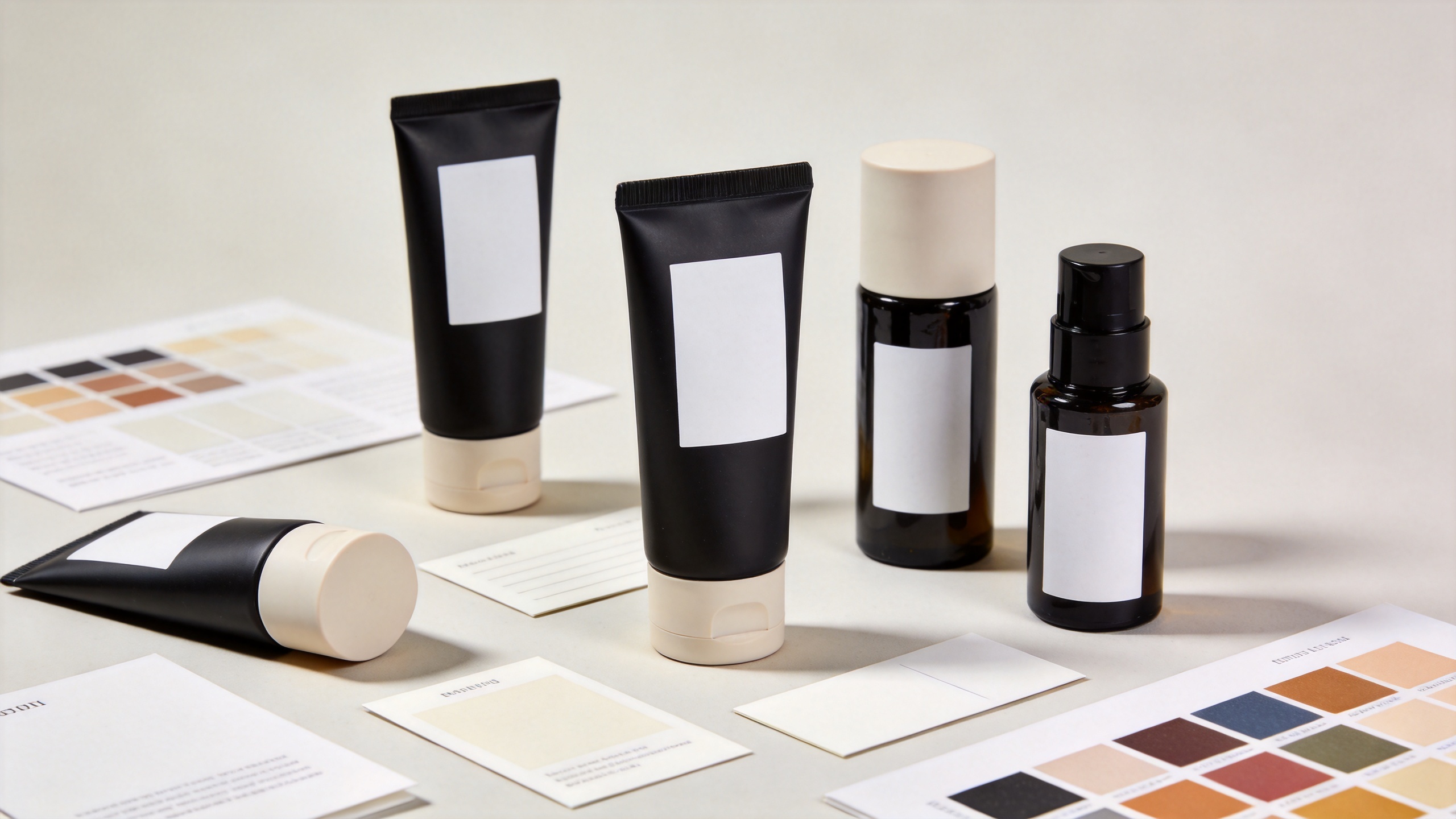
For black packages used across several SKUs, place representative products side by side. Include the longest product name, the smallest required text, the lightest graphic treatment, and the darkest accent color. This range review helps teams find problems that are easy to miss when each tube is viewed separately.
Choose Format, Closure, and Formula as One System
Appearance is only one part of packaging selection. The fill volume, formula viscosity, dispensing requirement, closure, and applicator all affect the practical result. A visually elegant tube can still be the wrong choice if its geometry or opening does not suit the intended application.
For example, a 22 mm black tube may be relevant for some eye-care or makeup concepts, but compatibility must be confirmed for the actual formula and dispensing arrangement. The 22mm Diameter Seamless Plastic Cosmetic Tube with PP Cap for Eye Cream for Lipstick Makeup is a useful starting point for discussing format, cap, and artwork requirements. It is not a substitute for formula compatibility and filling validation.
When reviewing the package, confirm the proposed length, diameter, volume, cap style, and application method together. Also consider whether the surface maintains its intended appearance after normal handling, filling, packing, and transport. These checks help a premium visual direction survive beyond the initial presentation.
Use a Clear Comparison Matrix
| Decision area | What to assess | Why it matters |
|---|---|---|
| Surface | Gloss, matte feel, visible marks, and finish consistency | Connects the package to the intended premium position |
| Artwork | Logo contrast, copy hierarchy, shade identification | Keeps the range readable across the line |
| Format | Volume, diameter, closure, and application method | Links the format to formula and user needs |
| Approval | Physical sample, artwork version, and specification record | Reduces late changes to the packaging |
The most useful comparison is not “black versus another color.” It is which version most closely supports the target product, the artwork system, and the intended customer experience. This gives brand, procurement, and filling teams a shared basis for discussing trade-offs.
Approve Physical Samples, Not Just Renderings
Physical samples resolve decisions that a rendering cannot. The selected package should be reviewed under relevant lighting, beside the outer pack, and next to neighboring SKUs. Handle the sample, read the smallest important text, inspect the cap relationship, and check whether the finish supports the intended impression.
A focused review should cover appearance, surface feel, readable artwork, closure fit, dispensing expectations, and the checks still needed during filling and shipment. Record the approved artwork version, dimensions, finish, and closure in a shared specification. This is particularly valuable when several stakeholders or markets are involved.
For premium makeup lines, black cosmetic tubes work most effectively when branding and operational details reinforce one another. A black surface may create the visual foundation, but controlled decoration and reliable approval steps create the final result.
A Practical Checklist for Black Cosmetic Tubes
- Define the product position black cosmetic tubes must support.
- Compare glossy and matte black cosmetic tubes against the actual brand direction.
- Test all important artwork on curved black cosmetic tubes, including small text.
- Review black cosmetic tubes, closures, and formula requirements as one system.
- Compare black cosmetic tubes across representative SKUs before final approval.
- Approve physical black cosmetic tubes and document the agreed specification.
Selecting black cosmetic tubes for a premium makeup line is a balance of visual intent and practical verification. When the package is chosen with print contrast, format suitability, range consistency, and sample approval in mind, it can become a flexible foundation for a coherent, premium makeup collection.