
 EN

Matte Finish vs Glossy Branding for Private Label Skin Care Tubes
A skincare tube finish should be decided before the final artwork stage, not treated as a late decorative add-on. It is part of the first impression a shopper forms before they read the ingredient panel or try the formula. In private label skin care packaging, matte and glossy surfaces can support very different brand signals even when the tube size, cap, artwork and formula are otherwise the same. The useful question is which surface makes the intended product position easy to recognize across shelves, samples and online images.
From a B2B tube-packaging perspective, the decision should combine the brand story, product category, retail environment and decoration brief. A finish also needs to be reviewed as part of the whole pack: base color, logo contrast, text legibility, metallic accents and the way the tube will be photographed. That is why private label skin care packaging is more reliable when the appearance direction is specified early rather than added after artwork has been finalized.
What a matte tube communicates
Matte tubes diffuse light rather than reflecting it sharply. This typically creates a restrained, tactile visual impression that can suit minimalist skincare, botanical positioning, clinical-looking ranges or premium daily-care products. A muted finish can give light colors, soft neutrals and carefully spaced typography room to breathe. It can also help a small logo feel deliberate rather than lost in a highly reflective surface.
For buyers comparing private label skin care packaging options, matte is often worth considering when the brief calls for calm, modern or understated presentation. The direction is especially useful when the product story depends on texture, formula cues or a focused brand identity rather than a high-energy retail effect. This does not mean every matte tube looks premium by default. A low-contrast logo, an overcrowded label layout or an untested color combination can still weaken the result.
Matte is a design system, not a single visual shortcut
A strong matte concept normally has one clear hierarchy: the product type, the brand mark and one or two supporting claims. Dark artwork on pale matte surfaces can feel grounded, while controlled foil or spot-gloss details can create contrast without changing the overall direction. Before approving the route, ask how the finish will interact with the cap, carton and product photography. A matte tube that is elegant in hand can look flat in a dim ecommerce image if the art direction does not provide enough contrast.
What a glossy tube communicates
Glossy tubes reflect light more directly, which can make color fields, gradients and bold graphics appear more vivid. This finish often fits energizing cleansers, brightening ranges, youth-oriented launches or products that need quick visual recognition in a crowded set. It can reinforce a fresh, polished or high-visibility presentation, particularly where the design uses saturated color, large graphics or a strong photographic language.
In private label skin care packaging, gloss is not limited to a value-oriented look. A well-controlled glossy surface can support a sophisticated brand if the artwork is disciplined and the decoration choices are intentional. The practical risk is overstatement: several shiny elements, dense copy and high-contrast color can compete with one another. Buyers should decide which visual element is supposed to catch attention first, then ensure the finish helps rather than overwhelms it.
When gloss can simplify a launch
If a product line relies on distinct variant colors, a glossy surface can make the color-coding system more immediate. That can be useful for multi-step routines or ranges with several textures and benefits. Gloss can also create a clear visual link between tube artwork and a more expressive carton. Review the tube as a three-dimensional object. Reflected light can change how small type, pale logos and fine line work read from different angles.
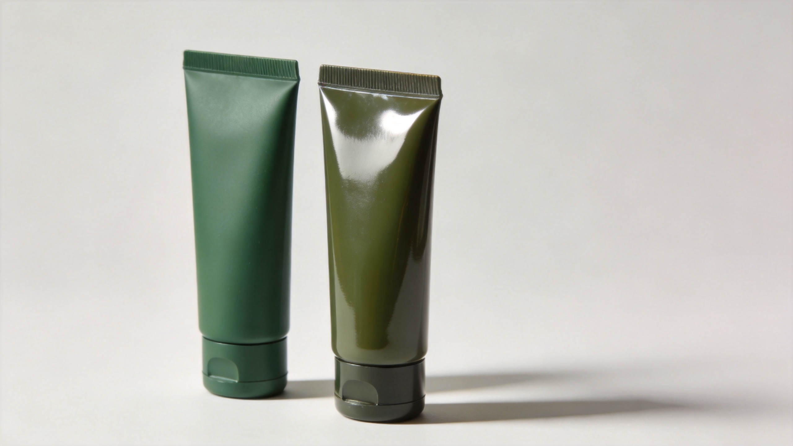
Matte vs glossy: compare the commercial question, not only the appearance
| Decision area | Matte direction | Glossy direction |
|---|---|---|
| Primary brand cue | Quiet, tactile, considered and minimalist | Vivid, polished, energetic and attention-led |
| Artwork approach | Works well with controlled whitespace and selective contrast | Works well with bold color blocks, gradients and clearer visual separation |
| Range architecture | Useful when a consistent premium family look is the priority | Useful when fast variant recognition is the priority |
| Proofing focus | Check logo contrast, perceived depth and how subtle colors reproduce | Check glare, fine-type readability and how colors perform under direct light |
Finish choice belongs beside brand positioning, not at the end of the artwork process. The choice affects what the buyer notices first and how easily the pack system can stay consistent across cleanser, serum, cream or treatment variants. For consideration-stage buyers, a short matrix like this is more useful than treating matte as “luxury” and gloss as “bright.” Both are tools; the brief determines the right one.
Build finish choice into the printing conversation
Cosmetic tubes can be paired with different decoration approaches, including offset printing, silk-screen printing and hot-stamping accents. The finish therefore needs to be discussed with the artwork, rather than as an isolated tube-surface request. A buyer should explain the intended visual direction, supply the latest artwork files and identify the elements that cannot lose clarity: logo, shade name, regulatory copy, barcode area or metallic detail.
It is also prudent to request a proof process that confirms placement, color direction and finish before full approval. A production-oriented proof helps the brand team see whether a subtle matte palette remains readable or whether a glossy layout creates unwanted glare. It gives purchasing and marketing teams a shared point of reference and reduces ambiguity when the artwork moves from screen to tube.
- Describe the target position in plain language: calm clinical, botanical premium, colorful daily care or another specific direction.
- Identify the finish-sensitive artwork elements, especially small type, pale logos, gradients and metallic accents.
- Review the decoration proof under more than one lighting condition and alongside the planned cap or carton where possible.
- Record the agreed color direction, finish and artwork placement as the reference for the production conversation.
Use a matched product as a starting point, not a template
For a visual reference, buyers can review this PE cosmetic tube for facial cleanser packaging with a green matte finish and custom printed artwork. It demonstrates a confirmed product direction that can inform a packaging discussion. It should not be treated as a claim that every design, material, decoration result or product application will be identical. The final tube specification should still be defined around the individual brand brief and approved artwork.
A practical selection checklist for private-label buyers
- Start with the customer promise. Decide whether the pack should feel understated, sensory, energetic, clinical or playful before selecting the surface.
- Map the range. Consider whether several SKUs need calm family consistency or high-contrast differentiation.
- Review the full visual stack. Evaluate tube, cap, carton, logo, color palette and ecommerce photography together.
- Protect essential information. Make readability of the product name, variant and required copy part of proof approval.
- Document the direction. A concise finish-and-artwork brief makes supplier communication more precise and helps teams compare options consistently.
A finish-brief checklist for private label skin care packaging
Use the same brief for each private label skin care packaging option so the brand team can compare samples on a consistent basis. For private label skin care packaging, record the desired surface response, color direction and viewing conditions before sign-off.
Ask whether the selected private label skin care packaging route makes the product type easier to recognize at a glance. Then test the private label skin care packaging artwork on the intended tube surface, not only on a screen. A clear private label skin care packaging approval record should note the chosen finish, the proof reviewed and any elements requiring close color control.
Choose the finish that makes the positioning easier to recognize
The most effective private label skin care packaging does not use matte or gloss as decoration for its own sake. It turns the chosen surface into a coherent signal. Matte can support a calm, selective or tactile story; gloss can support clarity, color energy and quick shelf recognition. When either direction is tested through artwork proofs and evaluated as part of the whole pack, buyers can make a more confident choice and give production teams a clearer brief.
For skincare brands and procurement teams, the next step is to compare the intended brand position against the actual artwork and packaging system. That turns an aesthetic preference into a practical specification decision.